M&S
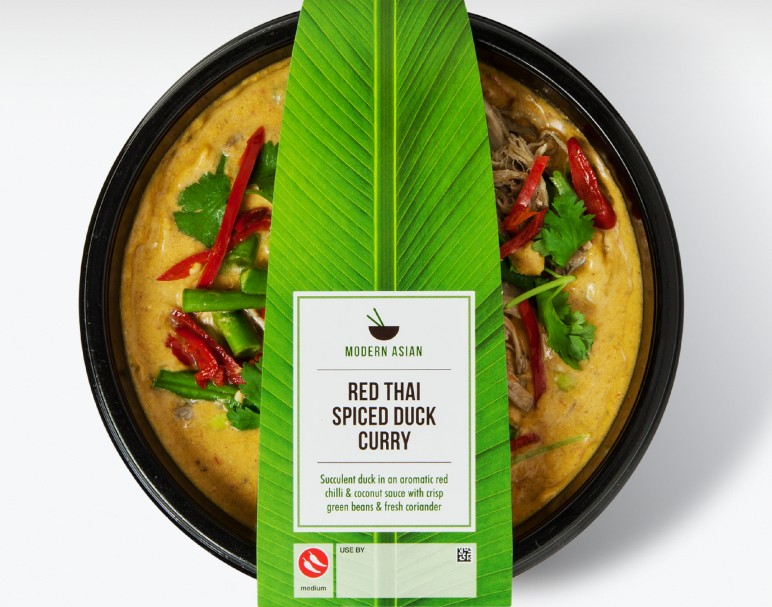
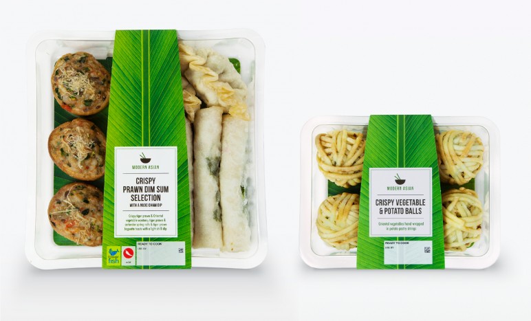
BriefMarks & Spencer was bringing out a new range of Asian, quick and healthy ready meals with an emphasis on fresh flavours. This needed to be communicated in a simple but authentic way that would have a lot of shelf presence.
SolutionThe logo of a bowl and chopsticks communicated Asian cuisine that was ready to eat, whilst the overall look took inspiration from simple Japanese design, together with a banana leaf that conveyed healthy, fresh and bold qualities.
ScopeIdentity
Packaging