| | | |

Sugarplum Children

Brief

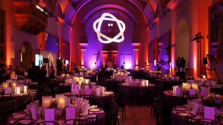
Sugarplum Children is a fundraising initiative for children with type 1 diabetes. It wanted a light-hearted identity to be used alongside the JDRF diabetes charity. Each of the four events over the years needed to look different and appeal to high-net-worth individuals.

Solution

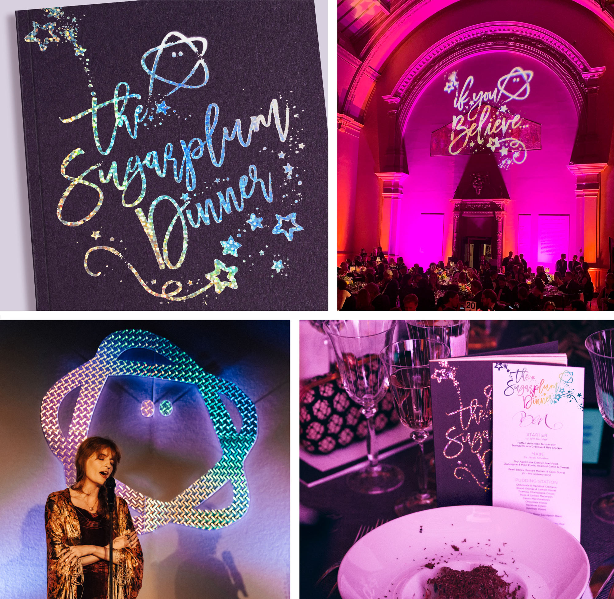
The Sugarplum Children identity was kept purposely naive, using plum colours together with a friendly “brave little star” character to symbolise the children affected.

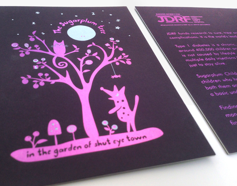
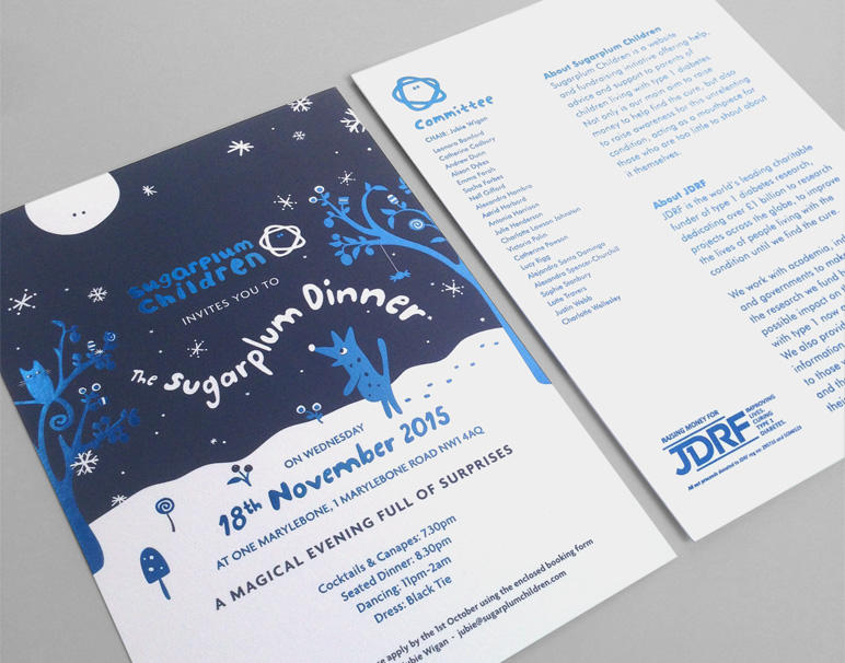
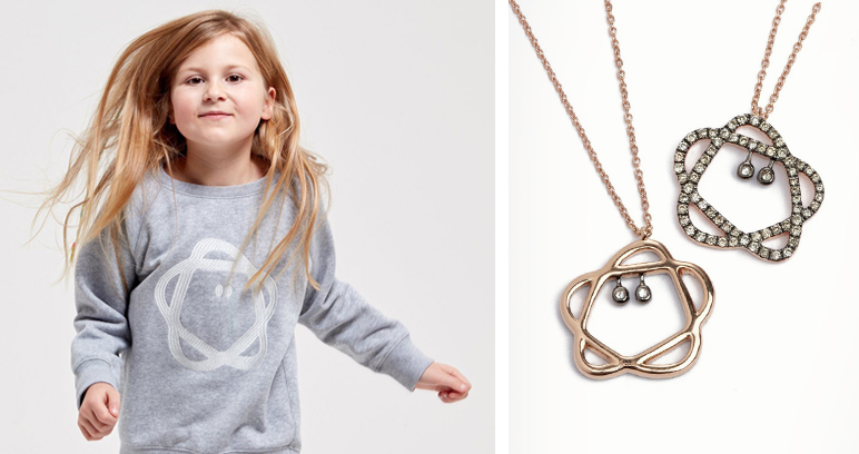
Invitations and event programmes were designed for a series of high-profile fundraising dinners. The first few featured an illustration of the Sugarplum Tree poem, and the most recent, in 2019, focused on a more grown-up, conceptual “if you believe” design. The designs for the four events used a mix of foiling, duplexing and blind embossing to achieve the utmost quality and appeal to the high-profile guests. The brave star icon was turned into an Annoushka Sugarplum diamond pendant and used on an Enlist sweater, with a percentage of sales going to the charity.

In just a handful of events, Sugarplum Children has raised over £1.6m for JDRF, the type 1 diabetes charity and funder of world-class medical research.

Scope

  • Identity
  • Illustration
  • Invitation
  • Programme

Similar Posts

  • |

    Lily’s Kitchen

    Brief Lily’s Kitchen, an established premium pet food brand, was launching new products to add to its range. Solution Designs were kept playful and in keeping with the brand’s values, existing design style and colour palette. New illustrations were created for the puppy milestone cards that came with the starter pack, to be used on…

  • | |

    Lady Balfour

    Brief Jubie Balfour and her husband needed invitation stationery designed for a party celebrating their anniversary and birthdays, held at the iconic St Mawes hotel in Cornwall. Solution Lady Balfour was keen to have an element of travel, as well as the iconic hotel, integrated into the design. With this in mind, the concept was…

  • |

    ManAlive

    Brief ManAlive, part of the Lakeland Cosmetics group, wanted to rebrand its men’s body washes while also launching a range of complementary beard oils. Solution A new identity was created using a stacked, abstract M and A that became a man icon. Strong colour blocking was used to make each fragrance and the packaging stand…

  • |

    Jafra Royal Promise

    Brief JAFRA is a well-established US skincare brand sold by independent consultants worldwide. Its Royal Jelly product range needed a facelift to bring it in line with competitor products. Solution The Jafra Royal Promise identity heroed the R, encased in a honeycomb shape to relate back to the product’s origin and the bee environment. This…