|

Jafra Royal Promise

Brief

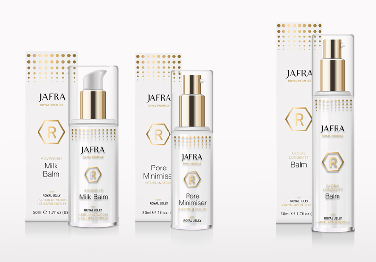
JAFRA is a well-established US skincare brand sold by independent consultants worldwide. Its Royal Jelly product range needed a facelift to bring it in line with competitor products.

Solution

The Jafra Royal Promise identity heroed the R, encased in a honeycomb shape to relate back to the product’s origin and the bee environment. This was then echoed as a pattern that transformed and softened into a circle, communicating product efficacy and the change in the skin’s appearance after using the products.

This work was completed solely while working for Holmes & Marchant.

Scope

  • Identity
  • Packaging

Similar Posts

  • | | | |

    Sugarplum Children

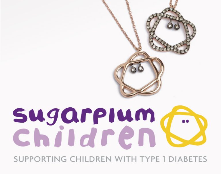
    Brief Sugarplum Children is a fundraising initiative for children with type 1 diabetes. It wanted a light-hearted identity to be used alongside the JDRF diabetes charity. Each of the four events over the years needed to look different and appeal to high-net-worth individuals. Solution The Sugarplum Children identity was kept purposely naive, using plum colours…

  • |

    Lily’s Kitchen

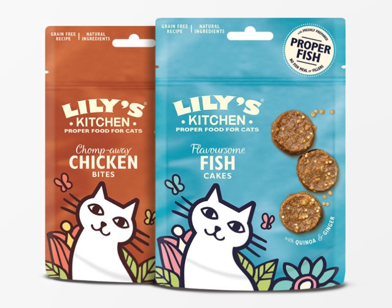
    Brief Lily’s Kitchen, an established premium pet food brand, was launching new products to add to its range. Solution Designs were kept playful and in keeping with the brand’s values, existing design style and colour palette. New illustrations were created for the puppy milestone cards that came with the starter pack, to be used on…

  • |

    Dr Körner

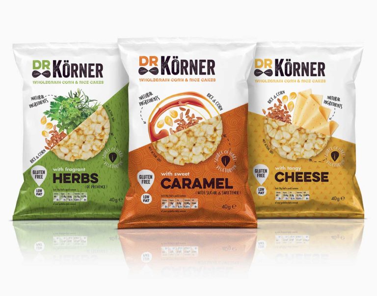
    Brief With the rise of the healthy snacks market, Dr Körner, an established brand in Russia, saw an opportunity to launch its naturally flavoured wholegrain corn and rice cakes in the UK to compete with challenger brands already on shelf, such as Kallo and Emily Crisps. Solution The identity had humour injected into it by…

  • | |

    Yllume

    Brief This start-up beauty brand needed a name, an identity and packaging for its illuminating skincare products. Solution The name Yllume (pronounced ee-loom) was inspired by the products’ illuminating qualities. A rich metallic purple was chosen as the brand colour, as it has historically been a regal colour implying luxury. The five products in the…

  • | | |

    Maison MK

    Brief An exclusive, high-end design boutique hotel in Marrakech required a full, slick design package. Solution The curved interiors of the riad inspired a bespoke contemporary round font, mixed with an ethnic-style MK. A star was added to create the jewel-like quality the hotel wanted to portray, and was used with the MK on the…

  • |

    ManAlive

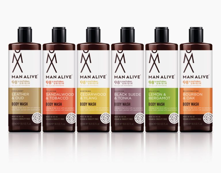
    Brief ManAlive, part of the Lakeland Cosmetics group, wanted to rebrand its men’s body washes while also launching a range of complementary beard oils. Solution A new identity was created using a stacked, abstract M and A that became a man icon. Strong colour blocking was used to make each fragrance and the packaging stand…