| | |

The Stylish Dog Company

Brief

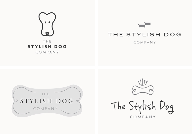
This start-up was looking for a timeless, elegant logo to complement the home and dog products it would sell through its shop and online.

Solution

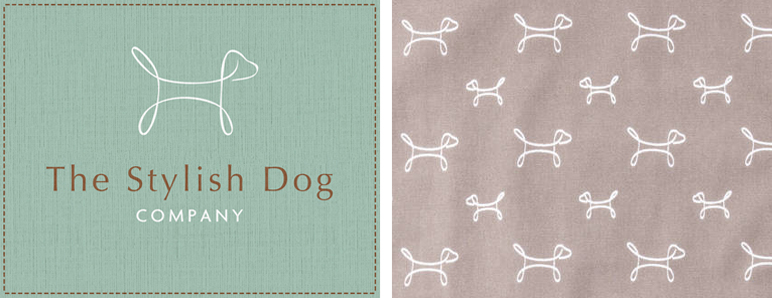
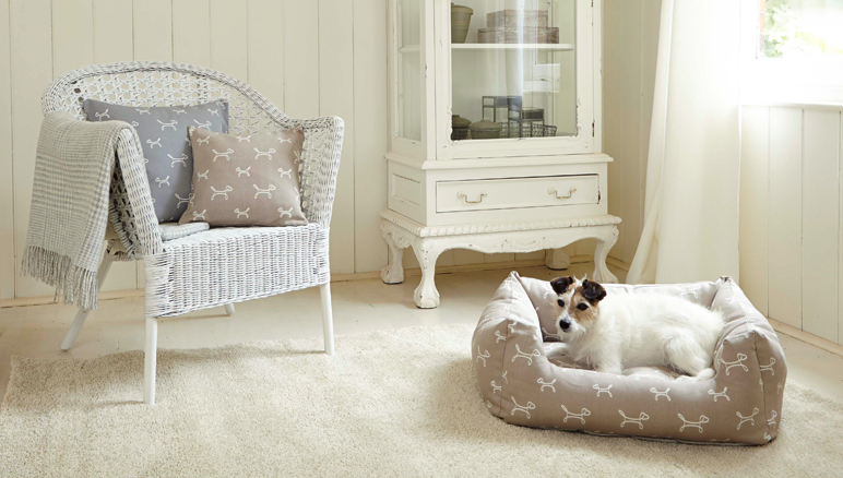
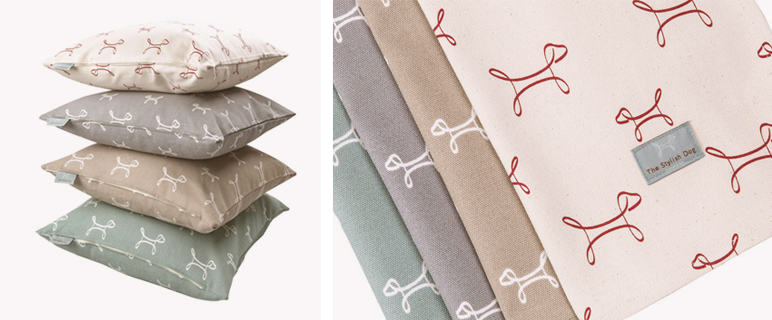
The identity needed a dog-led icon that could form a repeat pattern for use on textiles. The colours were kept sympathetic to dog and outdoor colours.

Scope

  • Identity
  • Brochure
  • Branded goods
  • Print

Similar Posts

  • |

    M&S Modern Asian

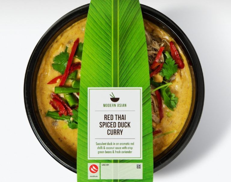
    Brief Marks & Spencer was launching a new range of quick, healthy Asian ready meals with an emphasis on fresh flavours. This needed to be communicated in a simple but authentic way with plenty of shelf presence. Solution The logo of a bowl and chopsticks communicated Asian cuisine that was ready to eat, while the…

  • | |

    Yllume

    Brief This start-up beauty brand needed a name, an identity and packaging for its illuminating skincare products. Solution The name Yllume (pronounced ee-loom) was inspired by the products’ illuminating qualities. A rich metallic purple was chosen as the brand colour, as it has historically been a regal colour implying luxury. The five products in the…

  • |

    ManAlive

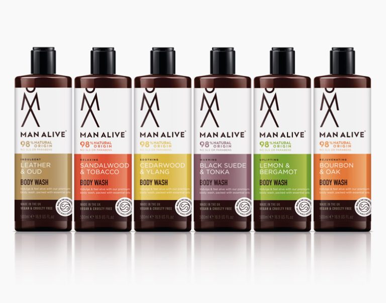
    Brief ManAlive, part of the Lakeland Cosmetics group, wanted to rebrand its men’s body washes while also launching a range of complementary beard oils. Solution A new identity was created using a stacked, abstract M and A that became a man icon. Strong colour blocking was used to make each fragrance and the packaging stand…

  • |

    Nubie

    Brief This online retailer showcases fresh, high-quality designs for the modern family home. The identity needed to be modern but also youthful. Solution A neutral, unisex colour palette was used for the logo to contrast with the colours of the products sold. Illustrations were commissioned for the Nubie brochure to add fun and character to…

  • |

    Jafra Royal Promise

    Brief JAFRA is a well-established US skincare brand sold by independent consultants worldwide. Its Royal Jelly product range needed a facelift to bring it in line with competitor products. Solution The Jafra Royal Promise identity heroed the R, encased in a honeycomb shape to relate back to the product’s origin and the bee environment. This…

  • | | |

    Rachel Vosper

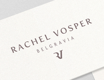
    Brief This leading UK candle chandler’s boutique wanted its branding to be personal and chic. Solution The boutique’s location, Belgravia, was used on printed materials to communicate the luxury of the brand and to direct people to the shop. Rachel’s initials formed a standalone icon used on packaging. The stationery used high-quality ivory card and…