Packaging

  • |

    ManAlive

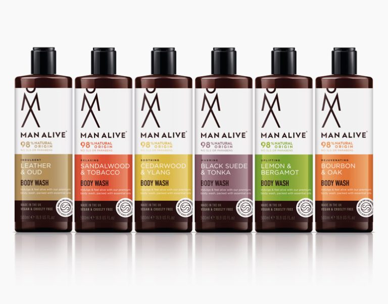
    Brief ManAlive, part of the Lakeland Cosmetics group, wanted to rebrand its men’s body washes while also launching a range of complementary beard oils. Solution A new identity was created using a stacked, abstract M and A that became a man icon. Strong colour blocking was used to make each fragrance and the packaging stand…
  • |

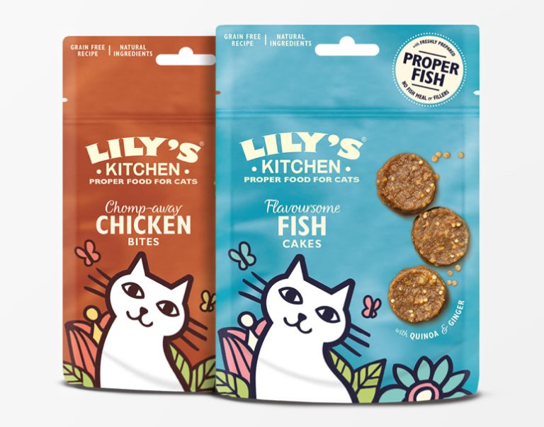
    Lily’s Kitchen

    Brief Lily’s Kitchen, an established premium pet food brand, was launching new products to add to its range. Solution Designs were kept playful and in keeping with the brand’s values, existing design style and colour palette. New illustrations were created for the puppy milestone cards that came with the starter pack, to be used on…

  • |

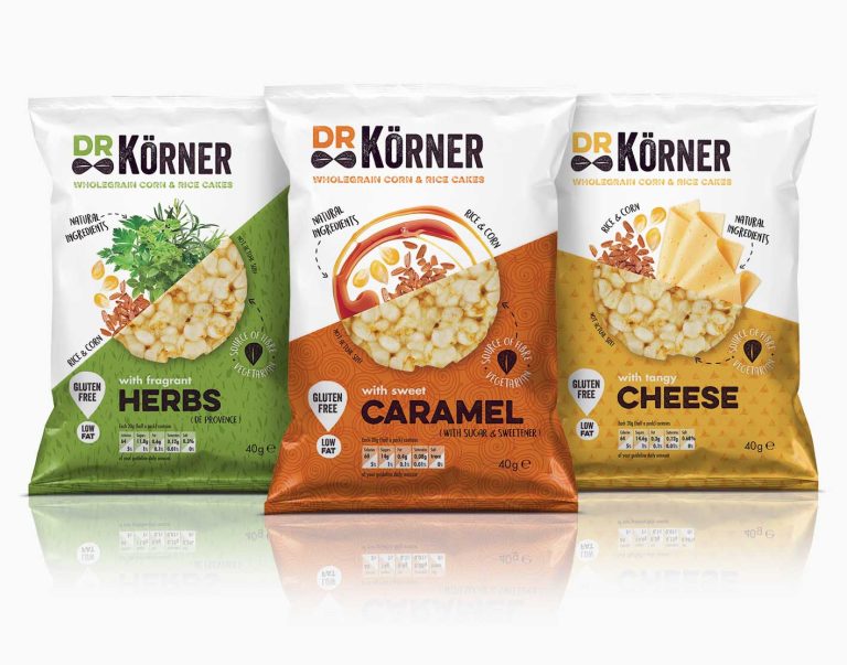
    Dr Körner

    Brief With the rise of the healthy snacks market, Dr Körner, an established brand in Russia, saw an opportunity to launch its naturally flavoured wholegrain corn and rice cakes in the UK to compete with challenger brands already on shelf, such as Kallo and Emily Crisps. Solution The identity had humour injected into it by…

  • |

    Jafra Royal Promise

    Brief JAFRA is a well-established US skincare brand sold by independent consultants worldwide. Its Royal Jelly product range needed a facelift to bring it in line with competitor products. Solution The Jafra Royal Promise identity heroed the R, encased in a honeycomb shape to relate back to the product’s origin and the bee environment. This…

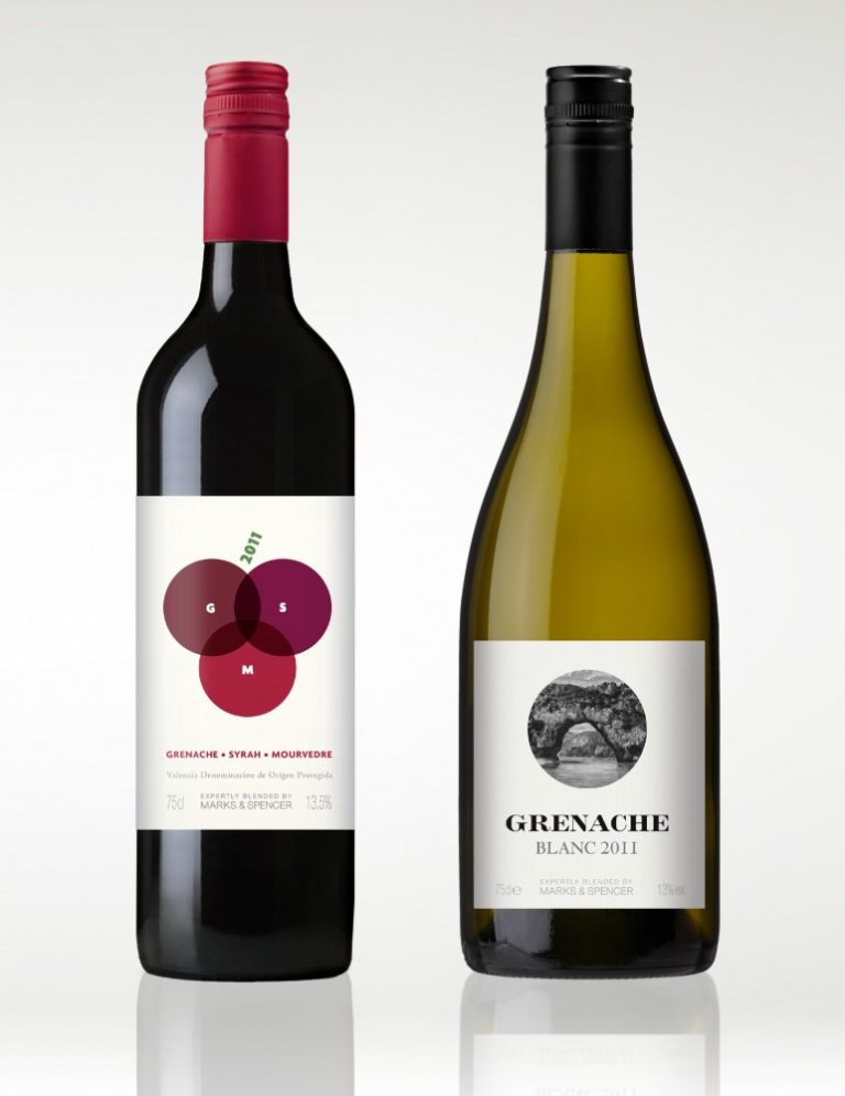
  • M&S Wine

    Brief Marks & Spencer needed a red and a white wine for its “£10 meal for two” range. Solution The GSM red is a blend of three grapes, so overlapping circles were used to represent this, creating a bunch of grapes. The Grenache white came from a region of France famous for its bridge. An…

  • |

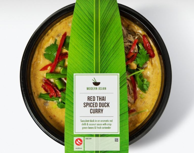
    M&S Modern Asian

    Brief Marks & Spencer was launching a new range of quick, healthy Asian ready meals with an emphasis on fresh flavours. This needed to be communicated in a simple but authentic way with plenty of shelf presence. Solution The logo of a bowl and chopsticks communicated Asian cuisine that was ready to eat, while the…

  • | | |

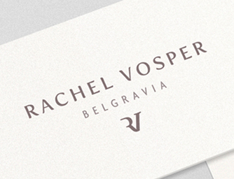
    Rachel Vosper

    Brief This leading UK candle chandler’s boutique wanted its branding to be personal and chic. Solution The boutique’s location, Belgravia, was used on printed materials to communicate the luxury of the brand and to direct people to the shop. Rachel’s initials formed a standalone icon used on packaging. The stationery used high-quality ivory card and…

  • | |

    Yllume

    Brief This start-up beauty brand needed a name, an identity and packaging for its illuminating skincare products. Solution The name Yllume (pronounced ee-loom) was inspired by the products’ illuminating qualities. A rich metallic purple was chosen as the brand colour, as it has historically been a regal colour implying luxury. The five products in the…

  • |

    Peachykeen Organics

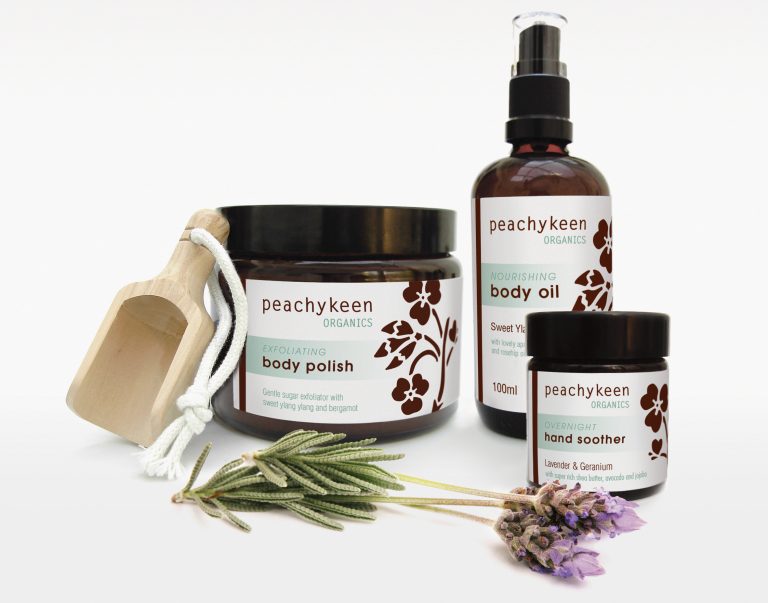
    Brief This start-up cosmetics company uses only natural and organic ingredients, and its new branding and packaging needed to reflect this. Solution Organic, naive illustrations were used with clean type to convey the brand’s qualities. The packaging was kept eco-friendly by having no outer packaging and using only glass jars, bottles and labels. Scope