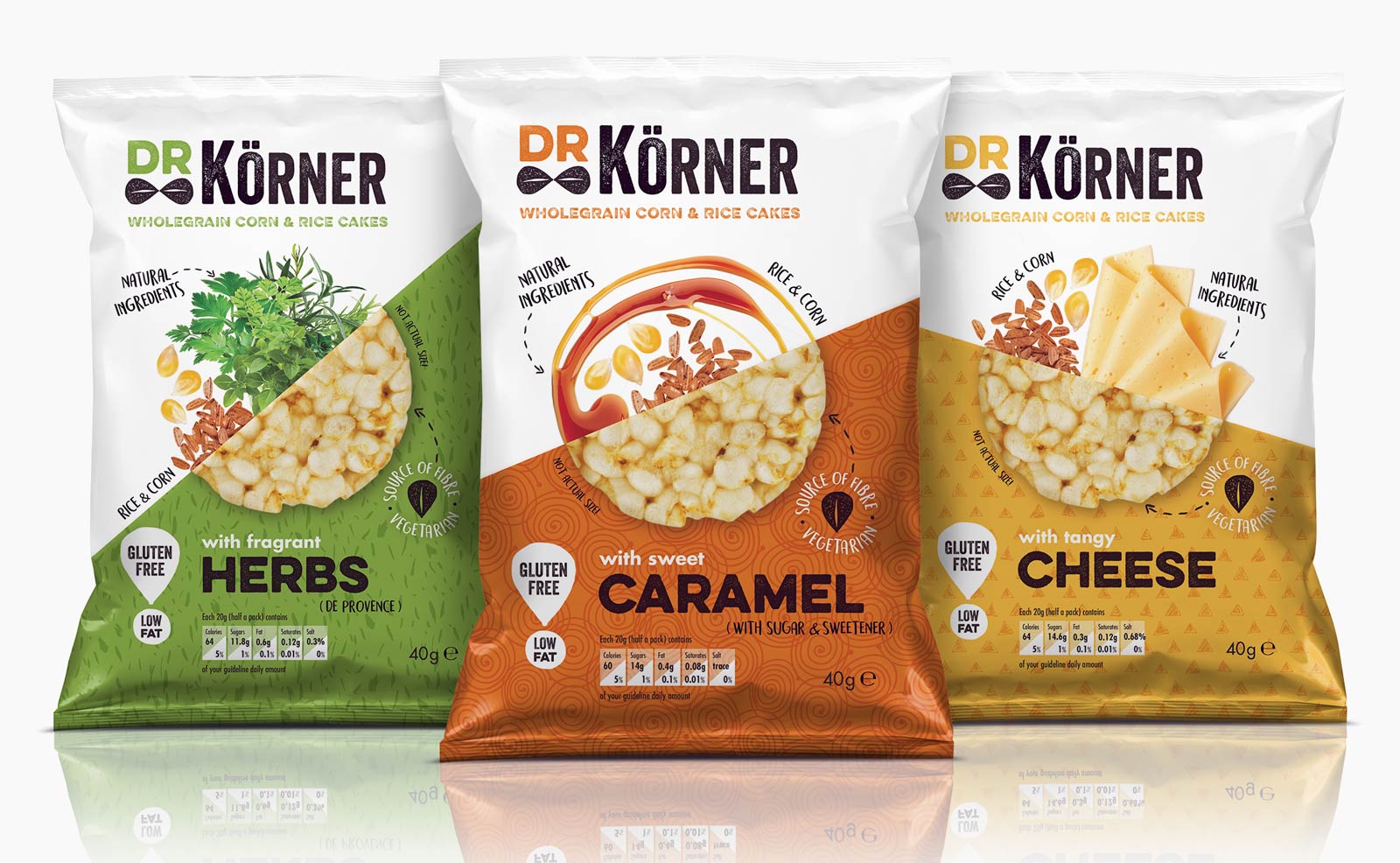
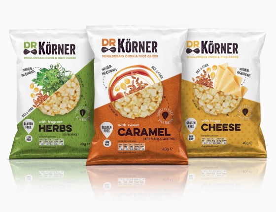
Dr Körner
BriefWith the rise in the healthy snacks market, Dr Körner, an established brand in Russia, saw an opportunity to launch its naturally flavoured wholegrain corn & rice cakes in the UK to compete with other challenger brands currently on shelf such as Kallo and Emily crisps.
SolutionThe identity had humour injected into it by using corn kernels which doubled up as a bow tie. The packaging adopted a playful coloured corner which related to the brand name, with the colour, background pattern and angle changing according to the flavour. The flavour was further communicated by bold and simple photography of ingredients emerging out of the corn cake to form a circle. Fonts with a natural look were used whilst product claims were highlighted in a friendly way utilising corn kernels as graphic devices.
This work was completed whilst working as part of a team for Wonderland WPA.
Identity
Packaging